
Office and Reception Signs: Interior Signage That Looks Intentional
Key takeaways
- Size the logo to the wall, not to the logo file — the wall sets the proportions.
- Return depth and finish matter more indoors than outdoors, because people stand close to the sign.
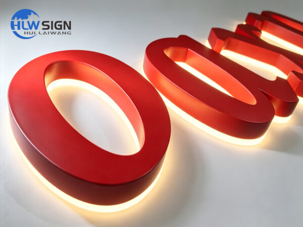
- Illuminated reception logos are usually backlit; a bright front-lit face can look like a shopfront indoors.
- Concealed studs and a drilling template give the cleanest installation on plasterboard and stone.
Interior signage has a harder job than exterior signage in one respect: nobody stands three metres from a shopfront, but everybody stands close to a reception wall. Small imperfections are visible, so the material, the edge and the finish carry the result. This guide covers the four signs most offices actually need.
Related reading: non-illuminated metal lettering · backlit logo signs and light boxes · vinyl lettering versus dimensional letters · request an interior signage quotation
The four signs most offices need
- Reception logo: dimensional letters or an illuminated logo behind the desk
- Office and department signs: door plates, room names, numbering
- Wayfinding: directional signage at lift lobbies and stair cores
- Compliance signage: fire, access and statutory notices, which are usually printed rather than fabricated
Reception logo: choosing the construction
| Construction | Look | Best for |
|---|---|---|
| Non-illuminated 3D letters | Quiet, premium, daylight-only | Bright lobbies, day-use offices |
| Backlit (halo) logo | Soft outline glow | The default for modern receptions |
| Front-lit logo or light box | Bright, graphic | Brand-led spaces, retail-style offices |
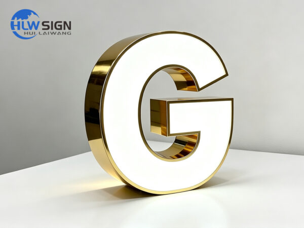
| Mirror or gold plated finish | Architectural, reflective | Professional services, showroom entrances |
Sizing, depth and mounting
- Width: aim for 50–70% of the clear wall behind the reception desk
- Return depth: 10–20 mm for interior letters up to 20 cm, 30–40 mm for larger logo walls
- Clear space: at least one letter height of empty wall around the sign
- Fixing: concealed studs into a template for plasterboard, a rail for uneven surfaces or stone
- Handling: allow for the blind spot behind a reception desk — cables and drivers need access
Door plates, wayfinding and the details people notice
- Keep door plate heights consistent across the floor; 1,450–1,550 mm to the centre is the usual range
- Match the door plate finish to the reception logo so the floor reads as one system
- Acrylic and brushed stainless are the two standard finishes for interior plates
- Colour matching: spray painting follows any PANTONE or RAL reference used in the fit-out
- Accessibility: tactile and high-contrast options are available where local rules require them
Send the logo as vector artwork plus two photos of the wall — one straight on and one showing the whole space. We will recommend a size, finish and construction, and quote it factory-direct.
Conclusion
Interior signage is judged at a distance of two metres by people who see it every day. Size it from the wall, choose the finish for the light in the room, put the drivers somewhere accessible, and keep the door plates consistent with the reception sign. That is what makes an office look finished rather than decorated.
Frequently asked questions
Should an office reception logo be illuminated?
If the space has strong daylight, non-illuminated 3D letters often look better. In darker or windowless lobbies a backlit (halo) logo adds presence without the harsh look of a front-lit face indoors.
What is the best material for interior wall letters?
Brushed stainless steel, painted aluminium and acrylic are the three we use most. Brushed stainless hides handling marks best; acrylic gives the cleanest colour match to brand artwork.
Can you match our existing fit-out colours?
Yes. Custom spray painting follows any PANTONE or RAL reference, and metal parts are available in brushed or mirror stainless with electroplated finishes including titanium gold, champagne gold and black steel.
Sources and further reading
- Wayfinding — Wikipedia — How interior signage guides people through a building.
- Accessibility — Wikipedia — Background on inclusive design requirements.
- Poly(methyl methacrylate) — Wikipedia — Acrylic, the most common interior sign material.
- Signage — Wikipedia — Overview of sign types and their roles.
External links above point to independent reference material. We are not responsible for the content of external sites.