
Signage Design: How to Design a Sign That Reads From the Street
Key takeaways
- Design for the distance the sign is seen from, not for the screen you are drawing on.
- Contrast beats colour choice: dark on light or light on dark always reads further.
- Fine strokes and tight spacing disappear when the design becomes a physical letter.
- Always mock the design up at the finished size on a photo of the building.
A sign design is a set of instructions for a workshop, and the workshop cannot invent legibility that the design left out. These are the rules we apply when we review artwork with a customer — the ones that decide whether the finished sign works from the road.
Related reading: custom channel letters · how to measure your storefront and choose a letter height · custom channel letters buyer's guide · send artwork for a design check
Start from the viewing distance
| Seen from | Minimum letter height | Notes |
|---|---|---|
| Up to 10 m | 10–20 cm | Interiors, malls, small shopfronts |
| 10–30 m | 20–40 cm | High-street and neighbourhood shops |
| 30–60 m | 40–60 cm | Roadside retail, larger premises |
| Over 60 m | 60 cm and above | Rooftops, pylon and large-format signage |
The rule of thumb behind the table is about 25 mm of letter height for every metre of viewing distance for comfortable reading.
Contrast, colour and the material
- Dark letters on a light fascia, or light letters on a dark one — mid-tone on mid-tone is the most common mistake
- Colour is a brand decision; contrast is a legibility decision, and they are not the same thing
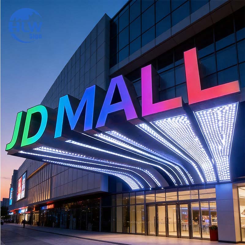
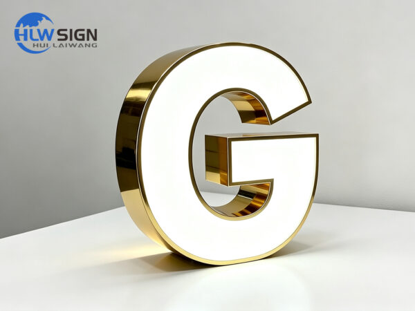
- A metallic return reflects its surroundings, so a mirror finish on a busy street can read as a blur
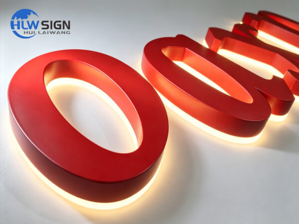
- At night, illuminated letters need contrast against the wall behind, not only brightness
Typography that survives fabrication
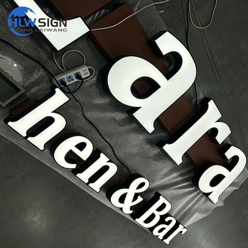
- Minimum stroke width is about 2 cm; below that a letter cannot hold enough LED modules for an even glow
- Script and thin serif fonts generally need 20 cm of height to stay clean
- Letter spacing: tighter than about 10% of the stroke width, recesses merge into one shape
- Counter spaces (the holes in a, e, o) should stay open at the finished size
- Test the design at 10% scale on screen — if it is unreadable, the sign will be too
Send the artwork and a photo of the building. We will mock the sign up at the proposed size and tell you if a letter needs to be larger, a stroke thicker, or the layout simplified before anything is cut.
Conclusion
Design with the viewing distance in front of you, choose contrast before colour, avoid strokes that fabrication will soften, and always approve the design at the size it will be built. Those four habits prevent almost every legibility problem we see in finished signage.
Frequently asked questions
How tall should letters be to read from across the street?
About 25 mm of letter height per metre of viewing distance: roughly 20–40 cm for a typical high-street shop and 40 cm and above for roadside sites. Send a photo taken from where customers will see it and we will confirm a size.
Why does my logo look worse as a sign than it does on screen?
Usually because of fine strokes, tight counters or low contrast. Logos drawn for screens often need simplification for fabrication — thicker strokes, wider counters, or a version with the strapline removed.
What is the smallest stroke width you can build?
About 2 cm for illuminated channel letters, because the modules need space inside the return. Below that we would recommend an embossed or printed sign instead of three-dimensional letters.
Sources and further reading
- Typeface — Wikipedia — Type design background for lettering on signs.
- Legibility — Wikipedia — Research context for reading distance and clarity.
- Letter spacing — Wikipedia — How spacing affects readability.
- Signage — Wikipedia — Overview of signage design and function.
External links above point to independent reference material. We are not responsible for the content of external sites.